Is documented
Is fully documented

Firefox colors are bold, vibrant, and attractive. They enhance the user experience by providing visual clues and bringing attention to primary actions.
Acorn's color palette is intended for styling Firefox user interfaces.
Acorn uses a subset of Mozilla's brand color palette, however, Mozilla's full color palette may be referred to and used for Firefox in-product illustrations—such as onboarding illustrations. You can reference Mozilla's color palette in Protocol, Mozilla's marketing website design system.
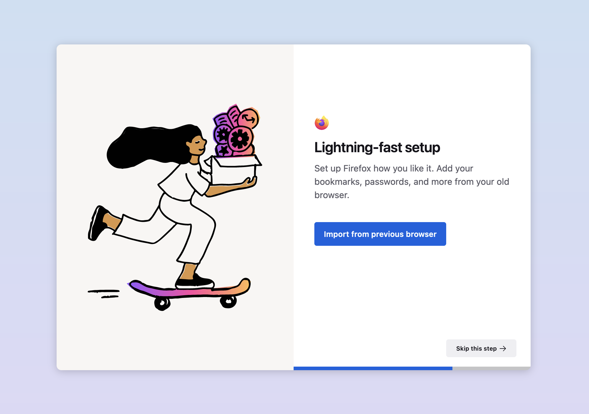
Example of the difference in color usage between illustrations and user interface elements within Firefox.
Below is Acorn's full color palette. Refer to the semantic color palette below to learn the meaning behind our colors and when to use them.
For the most part, blues apply to elements that use the Firefox brand primary accent color (e.g. primary button, links, focus outline) and element states the primary accent color can adapt to (e.g. hover, active, disabled). Blue is also used to color elements that indicate an informative message or update on desktop and Android and to color-code tab collections on mobile.
Grays are used for the background color of pages and overlays (e.g. modals and panels), the background color of buttons, text colors, border colors, and icon colors.
Light
Dark
On desktop, greens are used to indicate a new app update and to color elements that represent the concept of "success" and "new update".
On mobile, greens are used for color-coding tab collections.
We use Acorn's lightest orange for the warm tone called "Sepia" in iOS's reading mode.
Pinks are used on mobile for color-coding tab collections.
Purples are used as the private browsing mode accent colors.
Reds are reserved for elements that are used to represent critical feedback, errors, or destructive actions.
Mobile platforms use violets for icons, borders, text, and for color-coding tab collections. Android uses violet as a primary accent color.
On desktop, yellows are used to accent elements that represent the concept of "warning."
On mobile, yellow is used for color-coding tab collections.
Acorn's semantic color palette correspond to the semantic color concepts used throughout the product (e.g. Blue 50 = Color Accent Primary). This is the palette designers and developers refer to when styling our user interfaces. All of our semantic colors are aliases of the colors from the full color palette above.
Throughout Acorn's documentation—when appropriate and available—you'll see a semantic color value alongside its corresponding dark theme value. You can identify the dark theme color values through this symbol:

|
Primary
A primary brand accent color is used on recurring user interface elements to give Firefox a distinct look. Therefore, you'll see each platform's primary brand accent color used on primary buttons, focus outlines, links, toggles, checkboxes, and radio buttons.
While desktop and iOS share the same shade for light mode's primary accent color, we are currently improving accent color parity between platforms. Android's primary accent color is currently a violet shade. iOS also has implemented a new dark mode primary accent color shade of blue and desktop is expected to follow suit.
Mobile platforms share background colors but apply them towards different page and overlays contexts. Desktop uses these background colors, but doesn't currently follow this layer system.
Desktop and mobile platforms share some color values for text.
Android and iOS share a default border color.
Acorn supports both light and dark modes. Desktop and mobile share some of the same light and dark mode colors, but apply them to different user interface elements.
Firefox's light and dark modes are also treated as themes and correspond to Firefox's light and dark themes. While users can freely choose between the light or dark theme, their devices default to the mode their operating system is set to.
You can read about Firefox's support for certain high contrast mode themes in this guide's accessibility section below.
You can find background color values for light and dark themes under backgrounds.
Further WCAG resources:
Acorn strives for WCAG 2.1 minimum contrast guidelines.
There are different types of color blindness that makes people see colors differently. Color blindness also affects 1 in 12 people that were assigned male at birth.
Every operating system's high-contrast mode behaves differently. Some operating systems have default high-contrast mode color palettes, with some palettes being capable of user overrides. Other operating systems will increase the contrast on the existing interface colors.
You can learn how high-contrast mode themes work on Firefox for desktop in Firefox's source docs.
Is documented
Is fully documented
All States
Includes all applicable states (hover, focus, disabled, etc...)
All Themes
Works properly across all themes (theme name, theme name, etc...)
All Modes
Works properly across all modes (light, dark, high contrast)
All Desktop Environments
Works properly across all environments (Windows, MacOS, Linux)
All Mobile Environments
Works properly across all environments (iOS, Android)
Overall Accessibility
Has been tested and reviewed by A11y Team.
Color / Accessibility
All color has been tested against and passed all the latest WCAG 2.1 A & AA standards.
Text / Accessibility
All text has been tested against and passed all the latest WCAG 2.1 A & AA standards.
Contrast / Accessibility
All contrast has been tested against and passed all the latest WCAG 2.1 A & AA standards.
Interaction / Accessibility
All interactions have been tested against and passed all the latest WCAG 2.1 A & AA standards.
Content Design Review
Has been tested and reviewed by Content Design Team.
Writing Guidelines
Follows guidance for writing and language use.
Localization
Works properly across locales, and includes guidance for RTL languages.
Defined Behavior
Guidance for behavior when interacted with.
Defined Interactions
Guidance for interaction capabilities, ie. keyboard interactions.
Usage Guidelines
Includes guidance for usage, dos and don'ts, best practices.
Tokens
All attributes are available as tokens.
Figma Library
Has a reusable Figma component.
Storybook
Is documented in Storybook.
Code
Has a code counterpart.
Status
|
Date |
Version |
Notes |
|---|---|---|
|
Feb 14, 2023 |
1.0.0 |
Introduced color overview |